Conditional Formatting (CF) allows users to highlight important items in a visualization using mathematical or logical rules and graphical adjustments to the underlying chart or grid. Although CF is not a standalone visualization, it is a very important element of visualization construction. In this way, it offers extra information within a given chart design, and forms part of the process when building any given visualization.
CF is most often exposed through the use of color. However, it can also be exposed through graphical indicators in classic grids or as stand alone elements - which are effectively "gauges". Users can apply conditional formatting to all visuals, through a combination of techniques - ranging from basic context menu options; to drag-and-drop via the drop zones; via wizards (like the KPI tools); or through the comprehensive Conditional Formatting dialog. Importantly, all of the key elements of conditional formatting run off the same unified framework, allowing users to mix-and-match techniques, concepts and logic to achieve incredibly powerful visualization enhancements.
Conditional Formatting Logic
Conditional Formatting, unlike simple static formatting, is designed to use mathematical logic and formulas to drive the visualization effects. In this way, the formatting is usually dynamic, adjusting to the actual data in queries based on user interactions or simply from changes in the underlying data source (and both). The mathematical logic driving the formatting exposed includes
- Out-of-the-box formulas and frameworks that work without much intervention
- User configured adjustments to out-of-the-box logic
- Full function, and highly flexible user-defined logic
- A mixture of the above choices
The permutations are almost endless.
- Click here for a deeper explanation of the logic options for conditional formatting.
Types of Conditional Formatting
The logic and capabilities of conditional formatting in the application is mostly consistent across all visualizations. However, each visualization reflects the formatting differently and certain things do not apply in certain situations (like indicator on a chart).
Grids
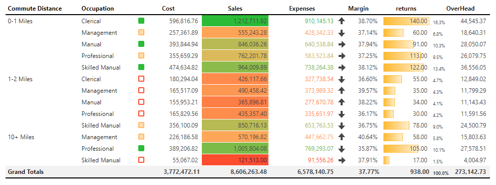
The use of conditional formatting is most prolific in grid visualizations. It is used to highlight data cells (points) in the grid using intelligent mathematics and logic: like showing the biggest and smallest values; highlighting groups of values (top 25% percentile); separating positive and negative values; flagging those figures above or below average.
Examples shown below (in order of left to right) include: colored shapes - ranked; linear background; linear foreground; arrows - ranked; data bars - percent of maximum; text - percent of total.
Gauges
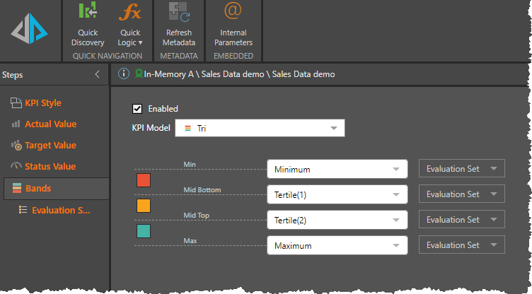
A variation of grid conditional formatting is the "gauge" - which produces a grid like interface made up of large graphical elements that represent multiple numerical values in a single composite graphic. At its core, a gauge is just an enlarged version of the mini "KPI shapes" shown in a grid (as per above). However, there is an option to show more information per data point - like target, status and actual values and then a separate set of values to drive "banding". The math in a gauge is identical to any other conditional formatting capability - however, users tend to build more complex logic when designing gauges owing to the multiple layers of data that can be included in each item.
Shown below, the gauges show quarter-on-quarter sales performance for manufacturers.

Charts
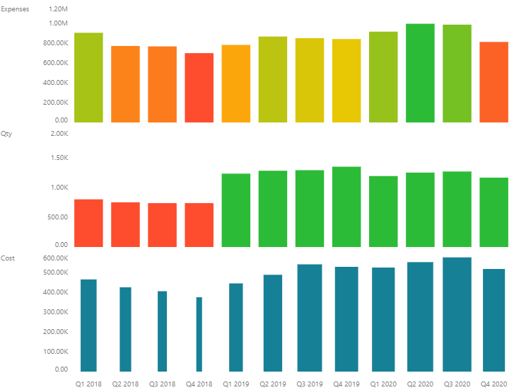
Conditional formatting can be used in all other non-grid charts (like the Cartesian charts) by typically changing the colors of the visualization to highlight data points. Similar to grids, the logic can be used to show high values vs low values; positive and negative values and any other logic.
Examples shown below (top to bottom) include: linear colors; average colors; linear sizes (width of the bar).
Setting Conditional Formats
Conditional Formatting in visualizations can be set from multiple "entry points" in Discover - ranging from the ultra simple context menus through to the advanced KPI wizard.
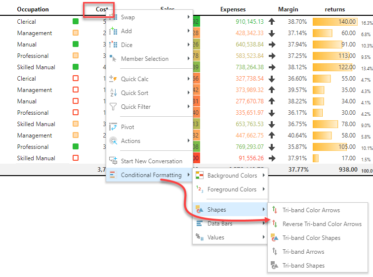
Context Menus
The easiest way to implement CF logic is via the right-click context menus, which will prompt the user with appropriate options based on what they right-clicked on. Users are free to click on members, measures or combinations of such elements to trigger the creation of the underlying logic and resulting visual effect.
- Click here for more on using the Conditional Formatting context menu.
Drop Zones
Another "entry point" involves using the drop zones in Discover. This approach involves simply dragging and dropping an orange value or measure chip onto the relevant drop zones (and sub-drop zones), to define and trigger formatting for the chosen target metric.
- Click here for more on using Drop Zones to drive conditional formatting.

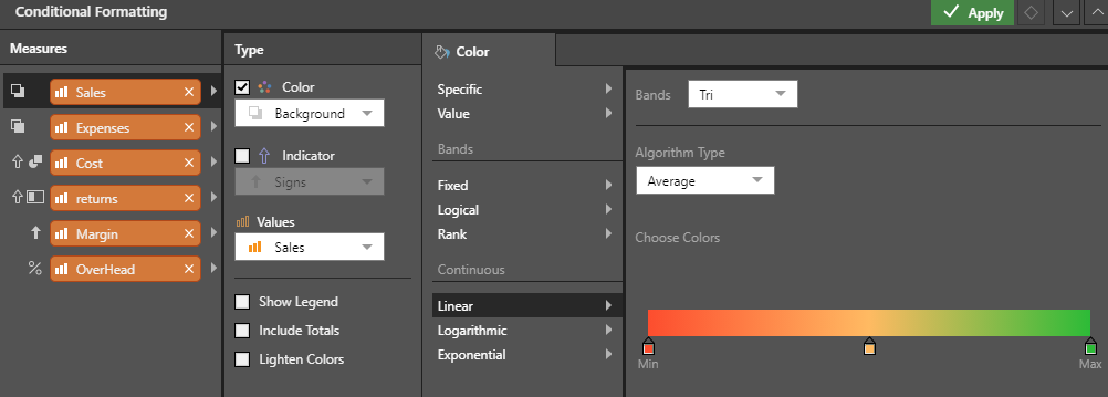
Dialog
The next entry point for conditional formatting is via the full dialog, which can be opened by clicking the Conditional Formatting button in the Design tab ribbon, or by right-clicking on any value chips found in the color or indicator drop-zones. The dialog exposes the full extent of conditional formatting capabilities covering multiple settings for driving colors and indicators (for grid and gauge visuals only). Within each type there are settings for describing the formatting logic, colors, indicator types and other miscellaneous options (like legends and total handling).
- Click here for more on using the Conditional Formatting Dialog
KPI Tools
The last entry point for setting conditional formatting is via the KPI toolset. Although this involves creating KPI logic (with actual, target, status and banding values), the KPI's actually drive the way data points in a query are shown with colors and indicators. And even though they are usually set for gauge visuals and simple indicator visuals in a grid, the logic and elements can just as easily be used to drive the colors of the data bars in a column chart.
- Click here for more on using the KPI toolset in Formulate.
- Click here for more on the Quick KPI wizard in Discover.